-
日期: 2014-01-24 | 來源: 龍騰網 | 有0人參與評論 | 字體: 小 中 大
Maps can be a remarkably powerful tool for understanding the world and how it works, but they show only what you ask them to. So when we saw a post sweeping the Web titled "40 maps they didnp~pt teach you in school," one of which happens to be a WorldViews original, I thought we might be able to contribute our own collection. Some of these are pretty nerdy, but I think theyp~pre no less fascinating and easily understandable. A majority are original to this blog (see our full maps coverage here), with others from a variety of sources. Ip~pve included a link for further reading on close to every one.
對於理解世界以及世界是如何運作的這兩方面來說,地圖是壹種極其強大的工具。但是地圖只能夠解釋你提出的問題。因此,當我們在看到壹個名為“他們沒有在學校裡教給你的40張地圖”的帖子席卷網絡,其中之壹恰巧源於WorldViews(譯注:即此文章專欄)時,我覺得我們或許可以做壹個我們自己的版本。有壹些地圖可能過於書呆子氣,但是我覺得它們的迷人程度並沒有少壹點兒,也很易於理解。其中大部分都是這個博客原創的,另壹些來源各異。
1. A political map of the world, circa 200 A.D.
1.世界政治地圖,約公元200年
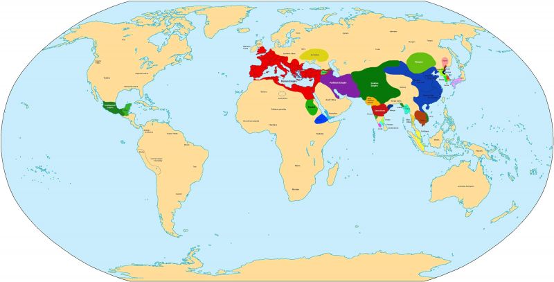
Whatp~ps more amazing: how much things have changed over the last 1,800 years, a major chunk of the civilizational history of humanity, or how many of this mapp~ps divisions are still with us today?
哪壹個更令人驚訝:在近1800年以來,人類文明史上有多少事情已經滄海桑田;還是有多少地圖上的不同今天仍是如此?
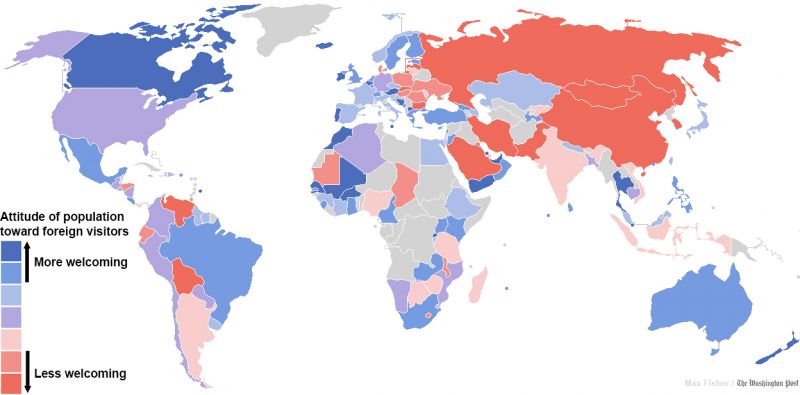
2. Where people are the most and least welcoming to foreigners
2.在哪裡人們最歡迎和最不歡迎外國人
- 新聞來源於其它媒體,內容不代表本站立場!
-
原文鏈接
原文鏈接:
目前還沒有人發表評論, 大家都在期待您的高見